


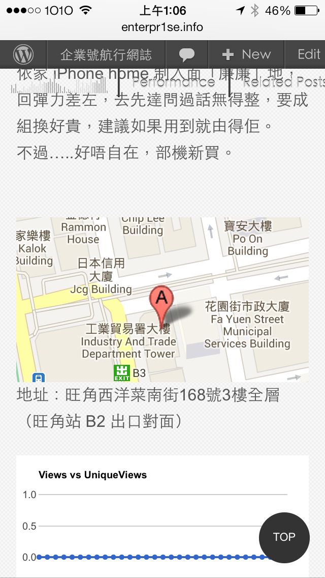
最近番本放題篇 blog 加上了店鋪 Google Map 地址,不過當我在手機上看就出事了,Google Map 並不懂 responsive(中文釋名「回應式」,十分唔好聽),所以版面被破壞了。
上網找過一下資料,原來 Google Map Embed code 用了 iframe,所以不支援 responsive,需要修改 CSS 以便支援。
看到一個外國網友有教如何修改 CSS 以便支援 Google Map 與 Bing Map.
只要在 custom.css 加上以下幾句
/* Flexible iFrame */

.Flexible-container {
position: relative;
padding-bottom: 56.25%;
padding-top: 30px;
height: 0;
overflow: hidden;
}

.Flexible-container iframe,
.Flexible-container object,
.Flexible-container embed {
position: absolute;
top: 0;
left: 0;
width: 100%;
height: 100%;
}
只要將 Google Map 的 code 加上
<!-- Responsive iFrame -->
<div class="Flexible-container">
Google 給你的 Code
</div>
將 google 給你的 code 放在 div code 入面就行了。
但是他的 Code 會 ignore 了 Google code 入面的 map size,總之令它用盡畫面的濶度,但個人不太喜歡這樣,所以修改了一下。
本人不是 programmer 所以未必準確但暫時沒有問題。
.google-map {
position: relative;
padding-bottom: 56.25%;
padding-top: 30px;
height: 0;
overflow: hidden;
}

.google-map iframe,
.google-map object,
.google-map embed {
position: relative;
top: 0;
left: 0;
max-width: 100%;
}
不過放 Google Map 的地方要修改為
<div class="google-map">
Google 給你的 Code
</div>
(方便我記得所以將個名改為 google-map)
在 Google Map 暫時看到的缺點是一開始載入時標示位置會在稍下的地方,但不妨礙閱讀,各位可以看一看效果。
https://enterpr1se.info/tag/map/
 姓名標示-非商業性-相同方式分享 4.0 國際 (CC BY-NC-SA 4.0)